
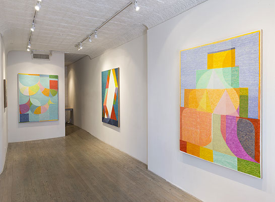
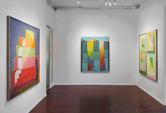
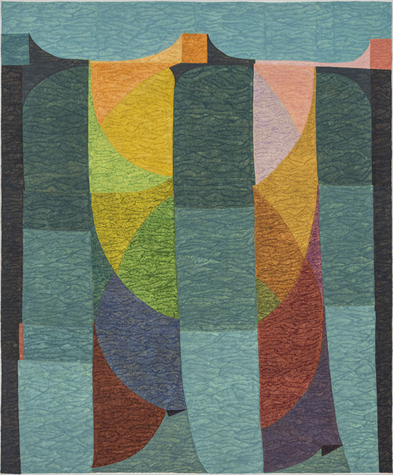
Installation View: Matt Phillips: Comfort Inn at Steven Harvey Fine Art Projects
Photography: Adam Reich
Yevgeniya Baras with Matt Phillips

Yevgeniya Baras: Let’s talk about this mark that’s really confusing to everyone. The very slow mark that appears to look like pencil or marker or maybe water color. What is it about that pace and that mark that appeals to you?
Matt Phillips: I painted with oils up until the last few years when I began making my own water based paint. Regardless of the medium, I’ve usually painted with small brushes, very slowly - even in areas of flat color. I am interested in feeling my way across the surface of the picture. With this new material, I am still painting in the same way, but it shows what I am doing more legibly.
YB: Oil would have blended the movements, rather than keeping them distinct.
MP: Right. So what you’re seeing now is all of these discreet passages that are overlapping one another and the edges where they overlap creates a darker seam. It’s just a slightly more opaque moment of color. I could obviously paint with a large brush, but working this way invites time into the image, and then as that happens, a secondary space starts to live within the picture. I really like that sort of inextricable relationship between time and space.
YB: Are you surprised that there are so many conversations about how the paintings are made?
MP: Yeah, because to me it seems like the most fundamental way to make a painting -it is just a brush and paint. I never thought of trying to develop some sort of signature move or way of using the material -like the way that Richter has the squeegee and Pollack has the drip. Maybe in our day and age, Keltie Ferris might be the first to be associated with the spray gun. To me it comes back to exploring my own interests in the core contradictions of painting. You have the illusion and the image that you’re seeing and you also have the object made from the material of paint. Maybe what’s a little unusual in my work is that these concrete and physical characteristics are not emphasized through a thick body of paint.
First Dance, 2015
Pigment and Silica on Linen 24" x 20”
Photography: Adam Reich
YB: These works have a presence without depending on that.
MP: I think that they’re very physical, but the hand and the material is embedded in linen.
YB: There’s still small wrist action. You can feel somebody is spending time with these paintings.
MP: And they’re actually more layered than they appear. I paint them really thin and I also re-gesso them along the way and bring them back to white. I erase and conceal and then keep building the image. In the end I want the paintings to have an internal luminosity.
YB: So the white is important, working against white. I wasn’t sure if there’s room for mistake.
MP: There is. Some have a ton and some are more high stakes, performative, one touch. Regardless, I want there to be a really direct transmission from my hand to the viewer’s nerves. I want the images to be as present as possible and retain a certain freshness.
YB: What is it about making your own paint? Do you need more steps?
MP: I tend to associate acrylic paint with toys, plastic bottles, and contemporary cars. Plastic isn’t very porous, it doesn’t evoke the natural world -like dirt and linseed oil. I want my paintings to be welcoming to the eye and absorbent. So I have arrived at a certain
middle ground using raw pigment and a silica binder. I don’t saturate the binder with too much pigment, though, and have arrived at a material that is in between watercolor and gouache. I want the paintings to be matte and for the viewer to be able to read them in the round without contending with a glare.
YB: This material doesn’t have that kind of dryness, plastic-ness?
MP: It is a fine line. My paintings sometimes die after too many layers of all this stuff and it does start to show itself as more of a polymer based, plasticky material.
YB: And the way you incorporate the weave of the canvas, has that always been the case? It is so coarse.
MP: No, that’s been more
San Marco, 2015
Silica and Pigment on Linen 24" x 20”
Photography: Adam Reich
recently. I think it’s another way of the image absorbing the gesture and body. For me, paintings are roughly equal parts body and mind. There is the seeing, thinking, and responding aspect of painting. And the other half is so physical -mixing, touching, pushing, scraping. I like seeing how this polarity of the body and the mind co-exist in a picture. I want my images to have one foot on the surface of the support and the other through it.
YB: Do you plan the paintings in advance or do they organically grow? Take for example this painting “San Marco,” do you tell yourself that within this work there is a central light shape from which everything is going to circulate? How do they unfold?
MP: They’re often improvised with no plan, although I have been revisiting and occasionally repeating motifs recently. The thing that I would say that connects all the paintings is that I often begin them using similar structures or armatures - they share the same bones. These starting points tend to be rather simple. They’re basically variations of a grid or other rather fundamental ways of dividing a rectangle. My paintings usually go through a period of being rather boring, as I am searching, cutting, and dividing the rectangle.
YB: But then, the longer I sit here, the more there are irregularities which counteract the system.
MP: The ghost in the machine.
YB: Asymmetry becomes really important. It’s somehow extra obvious.
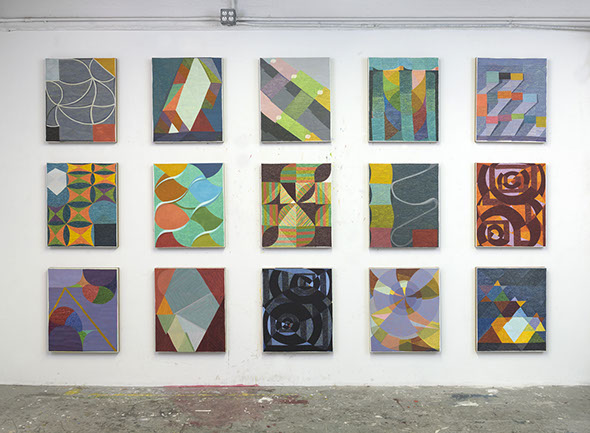
Wall of Small Panels: Studio Install
Photography: Adam Reich
MP: Let’s just say that they basically start with a grid. They are initially rational and systematic. The grid is non-memetic and denies perspective. In a way, the paintings begin by excluding the natural world and a lot of potential subjects. But that becomes something that I get to paint in relation to - a point of departure. I change things and, eventually, maybe the work evokes a form or a light or a space. I like that pivot, when the painting starts to regard something outside of itself - something unexpected arrives. Agnes Martin said something like “I paint with my back to the world.” She’s just in her internal world of the painting. I love Agnes Martin and I think there are a lot of ways to interpret that statement. But I think, right now, I would say that I might paint with my back to the world for a while but then, at some point, I turn around and open the windows wide. I don’t want my paintings to just be about an insular process. They are definitely about the world around me—music, dirty blue jeans, people, places, about things that cut through to the nerves.
YB: I don’t know that that kind of painting exists—the kind that’s separate from the world.
MP: No. Of course not.
YB: To me, every single thing, in the end, leads to the personal. Even counteracting the world is in a way being present in the world.
MP: What are Agnes Martin’s paintings about if not humanity and the impossibility of perfection?
YB: I’m quickly brought to all kinds of different associations with your work like craft, folk art, quilting, meditation, the human touch, children’s stories, architecture (like wood block castles), certain places… I wonder, as far as content is concerned.
MP: Some of those sources you mention are
1.jpg?crc=3990561598)
Bungalow (Spring), 2016
Pigment and Silica on Linen 58.5" x 48”
Photography: Adam Reich
totally important, like quilting and architecture. However I’m not specifically researching architects, rules of proportion, or anything like that. It is more about having a way to entice a relationship to the picture, both as the maker and hopefully the viewer. There are these forms. There is a notion of the space or an architecture that you could lend your body to. Some function more like a figure. Others are more intimate like an open drawer. I think paintings usually need to have something that holds you long enough that you can then get involved in the less namable subjects of the picture. Because most art has some sort of hidden agenda.
But sources and subject matter are really strange notions … I find in the studio that a painting either has a source or it’s completely nothing for me. All of a sudden something arrives and I’m interested in painting through it, or it’s just all of these decisions and shapes and ways of dividing a rectangle that have no internal spark, no resonance.
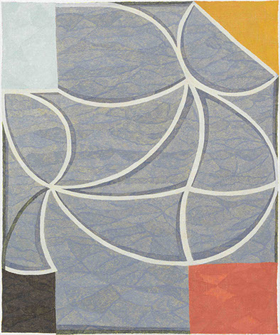
YB: Talk about that painting “Linen Service” - it really intrigues me.
MP: How come?
Linen Service, 2015
Pigment and Silica on Linen 24" x 20"
Photography: Adam Reich
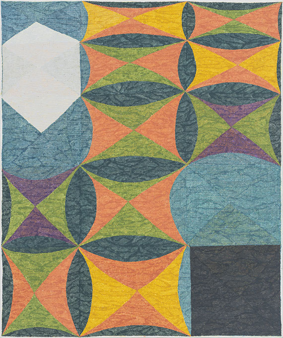
YB: I really like the color choices and the irregularities. It seems like there are two families living in this painting in the upper left corner and the bottom right. And they’re segregated. Maybe they are two actors on a stage. Maybe it’s about togetherness but also a kind of loneliness. I assign a human situation to that painting.
MP: That’s a strange picture. For a painter, we have our equivalent of musical scales, right? For instance, we have the color wheel and the passages through prismatic color from red to orange and then yellow until we reach purple, and that’s a sort of complete sequence for color. Or you have the incremental steps between white and black which represent two ends of a light spectrum. This painting presents a situation where you are asked to reconcile two sets of differences. In one corner you have a flat black square and in the other you have a white hexagon which can also be read as a volumetric cube.
YB: It’s like a boundary you’ve built in between them or a wall of some kind. Visually you have to hop over it or process it.
MP: Yes, that top hexagon could also be read as a cube - something achieving form from flatness. Maybe it is the black square at a different point or the same form simultaneously being two different extremes of itself. Whichever read, you’re left with this middle space that you have to contend with. You know, you wake up and you fall asleep in the same bed, but there’s all of this madness of the day in between—life’s changing and fleeting vibrations. The bed that you woke up in is like a postage stamp in your mind compared to the soft form that holds your body as you fall asleep.
YB: Do you ever think of using figurative elements in your work?
MP: I tend to think of the images themselves as figures. That’s one of the things about the white borders that you’ll notice in a lot of the paintings. Through the painting process, each image comes to inhabit and fill the rectangle in it’s own unique way. Some fill them completely and some just manage to touch one side. All seem to contend with a certain familiar gravity.

Arboretum, 2015
Pigment and Silica on Linen 58.5" x 48”
Photography: Adam Reich
YB: It’s a kind of unevenness, the presence of the human hand. At first I wondered if they were stretched correctly. Then you look to the sides [of the paintings] and realize it’s a conscious decision. I like that vulnerability.
MP: I like that the image itself arrives at a posture or a gesture - that it moves and squirms within the stage of the rectangle.
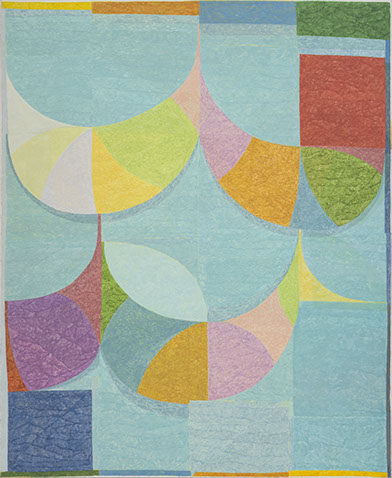
YB: This one behind us “Arboretum” could be a figure.
MP: That one is trying to be a few things at once and it has a certain concentric structure that I find interesting. Initially this work feels more like a space that I imagine projecting myself into. But I think it ultimately places you into a rather familiar viewing condition that is not unlike standing in front of another person. I like the idea that a painting can present a space that can contain the viewer, but that there is also something small and intimate to find while occupying this place. Something that you could take away in your pocket.
YB: It’s like a mound with a really curious slit in the middle. And that slit is enlarged in this work - “Mountain Mind.” How did you choose how to hang them?
MP: To this point I haven’t really been the kind of painter that produces specific bodies of work. I just tend to paint. I like bringing too much work to the gallery and seeing how the paintings and space contend with each other. I was definitely thinking about the size of the gallery though and how large of a painting it could hold. I wanted the paintings to have an indeterminate scale- to register as large while avoiding the heroic. I feel like the way that they’re touched and painted with such small brushes changes one’s sense of both the size of the painting and the internal scale of the image. Like a fingerprint on a large window.
Mountain Mind, 2015
Pigment and Silica on Linen 58.5" x 48”
Photography: Adam Reich
YB: There are these moments in “Mountain Mind” - as if a coffee cup was left on the painting and stained it. A trace of some casual daily activity.
MP: That was just an old decision that was painted in, then gessoed out, and then painted over. So you’re just seeing the same color over two different moments.
YB: That scale shift is really nice. There’s a giant white shape and a really small circle which feels so organic in comparison to everything else. Maybe that’s the only place where I feel like I’ve found the mistake.
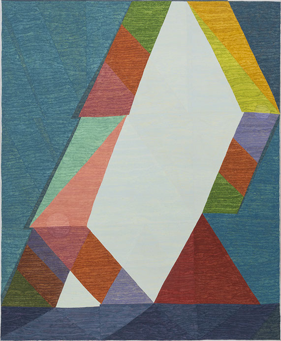
MP: There’s also a circle in the upper left corer of “Arboretum” as well but it is very slow to present itself. But this one for instance [speaking of “If The Falling Tide Can Turn]. This painting is so much more riddled with false starts and changes. This one got drug through the mud.
YB: It appears really fresh.
MP: It was completely re-gessoed several times. This painting probably went for 8 to 10 months. I really thought it was a goner a few times.
If the Falling Tide Can Turn, 2015
Pigment and Silica on Linen 58.5" x 48”
Photography: Adam Reich
YB: Your paintings have a playful side; they can be humorous.
MP: Yeah, I think all of the paintings really have an element of humor. They’re all a bit quirky. It’s funny because… I think I’m rather serious in the studio, laboring and trying to think and paint my way through these pictures. But then, in the end, I often stand back and think “what the hell is this thing?” I trust it but I don’t totally understand it. Painting is certainly a process of searching, losing and finding faith, and then ultimately arriving at something new. Maybe the humor is a way if making light of the drama that we go through privately in the studio.
MP: But I don’t want to make a joke as a way to undercut the paintings. Instead maybe a joke or a visual riddle is a way to try to get someone involved with the picture.
YB: There was one painting in the other room that when you walk in called “Slow Dance’, it’s to the very right. That’s a really surprising one.
MP: Yeah, that one is an oddball. It’s a little bit of needed poison for that room.
YB: Well it’s a fast one.
MP: Much faster.
YB: A lot faster than everything else. What made you call it finished and what made you put it in the show?
MP: I didn’t think that painting was going to be in the show, but then I liked that it was mildly irritating the other works. Also, in terms of the size of that sidewall, other alternates felt too large. That particular work shares so much of the same color as the white wall. It feels naturally smaller on that wall. But I also like that it was initially hidden when you walked into the gallery. It is a surprise waiting for you when you turn the corner - “what the fuck is that?”.
YB: The pace of it is so different. I feel like you made it in 15 minutes in comparison with everything else which feels like it was years of unearthing. I was wondering if that was your way of being funny, like “I’m going to take you through a few thousand years, but here’s 15 minutes”.
Installation View: Matt Phillips: Comfort Inn at Steven Harvey Fine Art Projects
Photography: Adam Reich
MP: I know what you mean and I like that idea. I probably see all of this better now than when we were hanging the show. But I don’t know, I feel like in the past, it was actually way harder to get my paintings to cooperate with each other. Each painting felt like it’s own beast.
It felt like so few of the paintings ever used the same set of materials - some I would collage a found object into and others ended up with sculptural additions. Part of my project at this time seemed to be about how many different things I allowed myself to do, you know, without feeling like a total crazy person.
Maybe part the of impulse about hanging that painting was that it helps to emphasize my interests in speed and scale through negation. I do think that work feels way more inline with the language and traditions of quilting. I love the quilts of Gee’s Bend, Moroccan rugs, and African textile. But I feel like with this more recent body of work is not so directly connected to those sources. I think at this point I am more interested in trying to activate a kind of deep familiar corporal intelligence that we bring to quilts and textiles rather than paint about those sources. Fabric and textiles are the architecture that we occupy first even before we are in this room.
YB: You’re taking them elsewhere.
MP: These sources are in my paintings but I’m not cracking open the Gee’s Bend book and contemplating my next decision.
YB: They feel like you start in one place and then it kind of unwinds rather than a superimposed plan of a quilted space. These paintings provide a fragmented experience.
The Kingston Line, 2015
Pigment and Silica on Linen 58.5" x 48”
Photography: Adam Reich
YB: If I walked in here not knowing you, I am not sure I would know who made these paintings. Age, Gender?
MP: Yeah, I have definitely heard things along those lines, especially when my works were more specifically referencing quilts. There were people who would say stuff like “Oh, a bunch of old ladies could make these paintings.” So there was this gender thing and also this age thing. The implication seemed to be, what’s a young male painter doing making these wimpy pictures? Which felt pretty sexist.
I think it is strange that a certain machismo has been so celebrated and rewarded through painting’s history - that attitude of needing to completely reject history, conquer the current form, a materialism of creativity. I think in a certain way this whole stance is slowly becoming dated and that it has less to do with being ambitious as an artist than one might initially think.
Today most of the cultural revolutions that are happening have a lot less to do with painting
than they did even 50 years ago. They’re more about technology, the internet, and the iPhone. It is painting’s job to absorb all of this. There’s such incredible innovation happening in digital media right now. But this doesn't replace painting, instead I think it creates a really special place for painting. As our visual world is becoming so much more fractured, simultaneous, virtual, and bodiless, I think paintings are actually becoming more and more real. Paintings are helping us to see the edges of how far a physical image can go before it turn into something that is altogether different. There’s such a special and potent space that has opened up for painting in that way.
YB: Clearly it’s really interesting. Already twice since the forty minutes we’ve been in the gallery, people have been surprised by the touch in your painting.
Return to Hot Chicken, 2015
Silica and Pigment on Linen 24" x 20”
Photography: Adam Reich
MP: One of the things that I am most interested in this body of work, is how my approach to making a painting generates a secondary space, one that is the result of searching for the image. The material itself creates its own independent illusionistic space and another layer of subject matter. In a way the paintings read as if someone took the work right after it was finished, and then crumpled or folded it up. Later, they then tried their best to flatten it back out. I am fascinated by this very shallow low relief space. It is like watching someone breathe through their shirt. This space feels like it is simultaneously the most abstract and the most real aspect of the work.
YB: There’s definitely a slight folding and a hint at depth.
MP: Which is a really different kind of space than the illusionistic space of the image. I love that tension and I like that the paintings ask for you to contend with two different spatial reads and maybe even contemplate how one spatial read relates to the other.
YB: I want that one- “Linen Service.”
MP: It just sold.
YB: Fucking Fuck!
Matt Phillips: Comfort Inn
January 6 – February 6, 2016
steven harvey fine art projects
208 forsyth st. & 237 eldridge st.
Gallery hrs: Weds – Sun 12 – 6pm and by appointment
Yevgeniya Baras is an artist living and working in Brooklyn, NY. Yevgeniya has a BA and MS from the University of Pennsylvania (2003) and an MFA in Painting and Drawing from the School of the Art Institute of Chicago (2007). Yevgeniya’s work has been exhibited at numerous galleries in New York including: Steven Harvey Fine Art Projects, Kinz + Tillou Fine Art, Zurcher studio, and Asya Geisberg Gallery. Her work has been reviewed in the New York Times and Art in America. Yevgeniya received the Artadia Prize and was selected for the Sharpe-Walentas Studio Program and the MacDowell Colony residency in 2015. In 2014 she was named the recipient of the Rema Hort Mann Foundation’s Emerging Artist Prize. Yevgeniya is represented by Nicelle Beauchene Gallery and will be having her solo exhibition in September 2016. Yevgeniya is currently teaching at CUNY.
Matt Phillips is a painter living and working in Brooklyn. He is currently having his second solo exhibition at Steven Harvey Fine Art Projects. Other recent solo shows include Staring at the Sun with a Penny in My Pocket, a survey of Phillips’ recent paintings at the University of Maine Museum of Art. He is a founding member of TSA (Tiger Strikes Asteroid) gallery in Bushwick and has been an assistant professor at Mount Holyoke College and Hampshire College. Phillips will be in residence at the MacDowell Colony for the month of February.

Disclaimer: All views and opinions expressed are those of the authors and do not necessarily reflect the views of the editors, owner, advertisers, other writers or anyone else associated with PAINTING IS DEAD.