
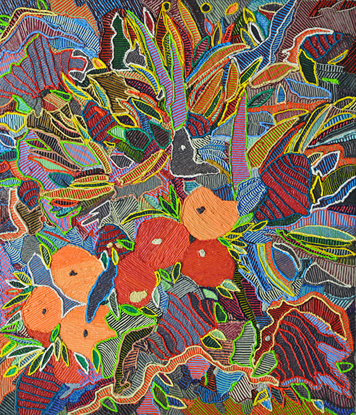
Orange Cup, 2016
oil on canvas, 27" x 31"
photograph courtesy of Caroline Larsen
Brigitte Mulholland with Caroline Larsen
Brigitte: You just had a really awesome show up at The Hole, Kabloom! I was really excited to see it because I had known the flower stuff, but I had not seen it A) get bigger—it did get really big—and B) you also (pardon the pun) exploded. You started doing these amazing new techniques and different landscapes, and car explosions. I’m really interested in knowing how that all came about and what your process is like and… I have a million questions but…
Caroline: Thank you! I worked really hard on the show and I am so happy with all the work and the installation! The floral work and the grasses, that’s what I’m working on now. The mountain paintings and the fire paintings are actually a lot older.
BM: No way!
CL: Yes! They came before. So in a weird way, chronologically, the show starts at the back. The large fire painting in the back, that’s from 2012. The one next to it on the left, that’s new. But the black one that has all the orange flames on it, that’s also from 2012. All the rest of the work is new. The fire paintings were the third body of work using the woven technique. The first woven technique paintings I made were tennis courts because of the grid. You see the sky, the line of trees, and the fence, and the net.
From there I got really into shipwrecks, because my parents moved to Panama five years ago. I love to go fishing and the fishing boat is a panga–which is just like a larger canoe with a motor on the back, so you're so tiny in the ocean. You would see the freight ships with the cargo go by because of the canal. They’re massive. They’re the size of a shopping mall or two city blocks. They’re so big. I got really interested in what happens when they catch on fire or when something happens to them.
At the same time, in New Zealand, where my husband Oliver is from, was the Rena—it’s a cargo ship that ran into a sand bank. I guess it got marooned at sea. And they don’t do anything—they just leave it there. All the cargo starts washing up on shore. And if something happens in the middle of the ocean they just sink it. So I got really interested in the accidents–and there are heaps of them. There are blogs about it. I just started painting cargo ships in peril.
From there, doing searches for cargo ships, I started seeing cars on fire. I started getting really interested, not so much in destruction, but in the way the flames and the smoke could be translated into paintings so magically. I started researching cars on fire, but all the cars on fire, I made sure that they were cars that fire fighters would set on fire for training purposes, so when I was doing my research I wouldn’t come across any death.
The training images are the best ones too. They were staged a little bit nicer for a source image. I just made one and I really liked the way it looked. That’s when I started getting interested in abstracting the image, and I started having the smoke and the flames just overtake everything. All the sudden, if there were five or six of them in a room, you could identify them as cars on fire, but if it was just one, you might not know what it is right away. It’s kind of like this in between of abstraction and being representative of the image. The work like Volcano, and Red Hot, and the two paintings on the opposite side of the wall, Drive and Fire: they’re not woven, but they’re cars on fire. They’re made with the “loop d loop” shape. I’m trying to have them so you know what they are by the title and the context of the title of the exhibition–but maybe if they were on their own, it would be more ambiguous.
BM: I remember seeing one of them and going, “Is that what I think it is?”
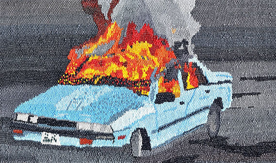
Sound the Alarm, 2012
oil on canvas on board, 80" x 50"
photograph courtesy of Caroline Larsen
CL: Yes, “is that a car on fire?” I finished that series of work and I thought, “I can’t paint any more destruction!” And I don’t want to paint planes on fire because I don’t really like to fly as it is, so I don’t want to start bombarding myself with that kind of imagery. I started thinking about what I was more interested in, in painting—things like gradation and color.
The woven technique also really represents, for me, pixelization. Because I work from images, found images and pictures I take myself. The idea that something you paint from is 3D, and when you make a painting of it, it becomes 2D—I was using that as a starting point. Each little weave mark is a pixel to me, but they’re also super crafty because they’re woven.
So that’s where the mountain paintings sort of started. And the mountain paintings all the sudden scaled up really large. When I first started making these paintings, they were really small, maybe one foot by one foot. Making a painting that was fifty by forty inches was huge. With the mountain paintings, they were all really quite large. That came out of when we used to live in Canada; Oliver and I started working in Alberta, we spent 8 months there for work. So we would see the Rocky Mountains every day. That’s where I started thinking about light—like light on mountains—and how everything reflects.
When we got back to Toronto and I started painting again, I was really interested in the mountain paintings because of the sky. I could do that crazy gradation, and with the colors, I felt really free. I could do the colors wherever I wanted because when you look at a mountain in real life, there’s purple, there’s blue, there’s yellow, there’s every color.
BM: And there’s color within the color too. It’s never just one shade of purple.
CL: Ha! I know! I have to candy stripe everything! I was reading an interview that Eric Parker did, I think for Juxtapoz Magazine, and he was talking about how many shades of green he uses in
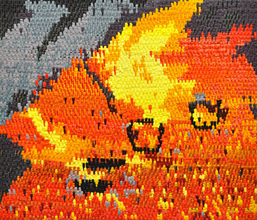
Red Hot, 2016
oil on canvas , 31" x 27"
photograph courtesy of Caroline Larsen
his paintings; I try to apply that to my work, especially in the grasses and leaves, but in the mountains too! I find in my work, that more color information I can put in the painting makes it so much more saturated and vibrant! Every body of work I work on, I usually paint it for about a year, year and a half, it seems, so I painted mountains up until I moved to New York to go to grad school. During that time is when I started getting really free with color! They’re all quite large, around fifty by one hundred and twenty inches, so could really explore massive gradation within the mountain itself.
BM: Yeah, those things are huge!
CL: And they’re super heavy because they’re all on panel. With my work, there’s so much technique and funny paint handling. With the mountain paintings, I feel like the technique of weaving really lends itself to the subject matter. And in my newer work, which is the florals and the house paintings, it’s important to me that the way I handle the paint is a direct reference to the actual object I’m trying to represent. So with all my new paintings—and I’m going to paint pools for the month of July—I’m going to try to paint the sky so it feels like you have the wind moving, and the clouds and the sun, same with the water, like squeegeeing paint across the surface to reference glass, the water on the swimming pool. And the trees and leaves too, trying to recreate that kind of texture in paint.
BM: That’s a tall order. (laughter) You don’t make it easy for yourself.
CL: I get kind of lost in the painting too, for instance if I’m making bricks on a house. I’ll try to make the bricks as “bricky” as possible.
BM: I like that about your work that the texture is so… They’re obviously paintings, but I could spend ten minutes on a tiny square because the texture of it, and the color, and even the surface, you can easily get lost in it. It’s a whole world in one little section.
CL: With the houses and the pool paintings—the paintings that are actually of locations
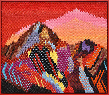
Ruby Mountains 2016
oil on canvas on board, 32" x 28"
photograph courtesy of Caroline Larsen
and spaces—I want it to feel as if you can really enter in the space. Like if you were a miniature person, if you were the same size as the door, you could actually be in that world.
BM: With the plant works, it’s a whole jungle in there. It comes off the canvas in its 3D way technically (with the paint texture), but it also inhabits a space that envelops you almost. It’s something that makes me always just fundamentally enjoy looking at your work.
CL: Oh thank you! That’s kind of, with the abstract work—not so much with the grasses that were in the show at The Hole, but the early work, which was a little bit darker in palette. The idea behind that would be like being out in Florida, because I grew up in Florida, and in the night it’s super hot, and all the foliage is so much more saturated and luscious because it’s so humid and there’s water beading off of it, and you’re really, temperature-wise, super hot.
BM: Yeah, that feeling, atmospheric.
CL: Yeah, so that’s the idea behind those works. Same with the larger grasses. You’re kind of enveloped in this other world.
BM: It makes sense too with how you’re interested in light, and how subtly shades can change, or how a change in temperature can change how something feels or looks.
CL: I love that. And especially with the larger four works, I really started playing with weird patterns and weird striping, and just weird paint-fetishy things.
BM: I love the really subtle differences in color, or I want to say the “stripes” things. I really dig it.
CL: Oh thanks, I love making the stripe patterns too.
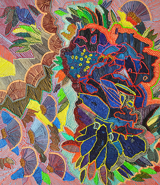
Fan Dance, 2016
oil on canvas, 31" x 27"
photograph courtesy of Caroline Larsen
BM: How do you do that?
CL: I just match the two colors in the bag.
BM: Oh ok, so it is just two colors in the bag and it comes out that way?
CL: So sometimes it will just work out perfectly. If the paint is the same viscosity, I can get them both in the bag. Usually I’ll just put a jar down and I’ll situate the bag and I’ll try to squeeze both at the same time. Sometimes it’ll work perfectly, where I squeeze it out and it’ll be an amazing equal red and green, but sometimes I just squeeze all the paint out and start again.
BM: You must use so much paint!
CL: Yes! So much! The woven paintings take a horrendous amount of paint. So much paint that every ten minutes, I’m emptying out another tube! But the floral ones don’t take up that much paint in comparison. I buy all my paint online.
BM: In bulk?
CL: Yes.
BM: How long do the mountain ones take you? They seem incredibly labor intensive.
CL: The sky won’t take that long because it’s all gradation. I’m not stopping and starting again. I can think, “I want the sky to start off purple and then end blue with a little yellow.” It’ll take maybe ten to twenty hours to do a sky. And then the rest: a few more days up to a week or two, twelve hours a day… The paintings take around seventy to ninety hours. But only if I know what I’m doing, if I’m super confident in how the painting is going to look. Sometimes I’ll paint for three days and I’ll have to take a photo of the painting and keep looking at it to figure out what’s my next move. So sometimes it’s super intuitive.
BM: What do you do when you come up against that, when it’s not working? Do you leave it? Do you try something else?
CL: No no, if it’s not working, I take the paint off immediately with a palette knife. Because I can save the paint if all of the sudden I can’t see where something is going. It’s tricky with the woven paintings. I have to start from the top and go down.
BM: So you definitely need to have some sort of plan.
CL: Oh yes, they’re super planned out. The houses and the abstract floral things, even the cars on fire, they don’t need to be super, super planned out. But the mountain paintings are highly planned out. I have to start at the top and go all the way down. In a weird way, I don’t know if they’re going to work until I’m done. Because you’ll have 75% of the painting done and then I’ll think, “I don’t think this is going to work,” but then I finish it and it’s, “OK, it’s ok.” For example, that red painting that’s the invite image, 75% into that painting I thought, “this painting is not going to work!.”
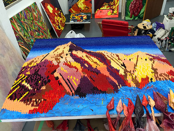
Work in progress in studio of Caroline Larsen
photograph courtesy of Caroline Larsen
BM: I love that one too.
CL: It’s so jarring to see the painting, and then there’s a flat orange bit—you know, like the underpainting. You just have to finish them. Sometimes I’ll do something dumb with the sky, like go purple to blue with an orange glow around the mountain. And I’ll do that and think wait, is that the sky or is that just part of the mountain? All the sudden, it’s just confusing, visually, to me. I can go on top and add another layer of painting, but then it breaks the weave, the illusion of the weave, which now to me is fine. But when I first started making the paintings, I would think, “there’s no way I’m breaking the illusion of the weave!” Also, they’re hard to handle. If something happens to them, it’s really hard to go in and match a gradation part.
BM: They must take a really long time to dry too.
CL: Getting ready for this show, it was so hot! That humidity just sucks the paint out too. But if you paint directly on board it dries a lot faster because it leaches oil out of the paint. All of my stuff is canvas over board anyway, but with the board, it dries it out faster. They crust. You get a little crust on them in a few days. I used to have super long hair and my ponytail would swoop through them. And it’d be annoying because I’d wonder “where’d this paint come from?!” So now I make them with a cap. But even with a baseball cap on, you have to watch out for the brim. So if you go in to look at it, you can put your brim across.
BM: The hazards of being a painter. So do you do sketches before paintings or do you sketch directly on and work from there?
CL: I just sketch directly on and work from there. But I work from photos, so I’ll find a whole bunch of images that I like and then I’ll just draw up the image. After that, I don’t use the image anymore.
BM: Do you plan for your color palettes or is that more intuitive too?
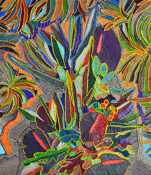
Tropical Nights Arrangement, 2016
oil on canvas , 27" x 31"
photograph courtesy of Caroline Larsen
CL: That’s all intuitive. Though, with the houses or the swimming pools, not so much. But with the floral paintings, yes. I’ll go in and—for instance, I really like red and green together, so I love the palette of having paintings that are just red and green, but that are so many different shades of red and green. Or I’ll go into a painting and think, “this painting is just going to be blue and purple and flesh tone,” and know that’s going to be the dominant colors through it. But sometimes I’ll just start out with a section that’s maybe a foot big, and it’ll kind of grow out from there. As I go I’ll think it needs more magenta or it needs more blue, so that’ll all kind of be more intuitive.
BM: Do you ever hit walls with the floral ones?
CL: Sometimes. Yeah, I just take it off, scrape it off.
BM: Do you ever just toss a painting?
CL: Oh, Sometimes I will throw them out. There are some in my studio that I’m trying to work out, they get banged up in here too, but this one where I have flat and thick on top, that’s something I’m trying to work out, how to do that a little more successfully. Same with having the underdrawing come through. They’re all ideas. One day I’ll figure out how to do it. It’ll kind of happen that I have all this work that I’m excited to do, but then I’ll finish it and all the sudden I’ll just go back to work that was half finished and finish it up.
BM: It can be tough to know. Do you ask other people if they think something is working?
CL: The only person I see regularly is Matt (Kleberg). We’ll talk about stuff, how it’s going, or what’s working in other paintings and how to translate that into a new work. And Oliver, my husband, he pops over about once a week! But for me, the best part is making the work. I mean, I’ll make paintings and think, “this is the ugliest painting I’ve ever made” and it will be the most popular painting in a show.
BM: There’s a funny kind of letting go that happens.
CL: Yeah, after it’s made I’m just kind of like… “eh, uh.”
BM: Sort of an, “as long as I’m satisfied with it, let the world do with it what it wants.”
CL: That’s kind of how I feel.
BM: It’s nice to not be precious about it because you can’t after a while.
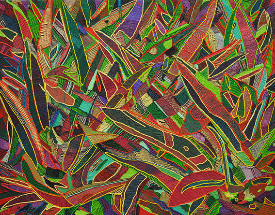
Oyster Plant, 2016
oil on canvas , 31" x 27"
photograph courtesy of Caroline Larsen
CL: Yes. I made it and, if I really didn’t like it, I would have destroyed it or hidden it. So I obviously liked it enough to put it out there. Even though it might not be my favorite work.
BM: Does that trip you out, when you start to do your next work, or do you shut out whatever the opinion is of the most popular pieces?
CL: I don’t think it affects me. I’ve never done a commission. Making work on somebody else’s terms, I find really difficult. Painting to me is my job and what I do all day, but it doesn’t really feel like I’m working for anybody else. I can’t paint your dog.
BM: Yeah it can’t be for someone else. There’s something special to it. That sounds tacky but there’s a magic to it that happens—it’s from you and it’s not from someone telling you.
CL: I’ll find images. I painted this one house that was a red stucco house. My friend’s step mom posted it on her Facebook page. I guess her sister-in-law said, “Caroline you can paint this as one of your house paintings!” kind of as a joke, and then I thought, “maybe I can.” I’ve got to change some things—“I don’t like this walkway here…”—but all the sudden it became, “man this is a good painting!”
I had a show in Los Angeles last year and I was two paintings short, and I had to make house paintings. I work from photos I find online for the houses and sometimes there are just no good houses. It’s mostly just real estate listings. So sometimes I’ve either found all the images I like, or there are none. So I’ll find people I know in Los Angeles and get them to send me photos of their house.
BM: What’s the criteria for your photo selection?
CL: That’s maybe the
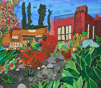
Red House, 2015
oil on canvas , 31" x 27"
photograph courtesy of Caroline Larsen
most labor-intensive part. It takes a long time. I’ll start with a Google search. If I’m at my parents’ house and they’re watching TV, I’ll just plop on my computer and do this for what, 4 or 5 hours a night. I can watch Downton Abby and do this at the same time. I’ll start off with a search like “California houses with cactus garden”. And that will usually come up with nothing good, but I’ll come up with one image I kind of like and I’ll keep clicking and clicking and clicking until I’m deep into the related images search. Then I’ll find a house with a garden, it’s all about the garden—the house is just another element of the painting, lately I have been getting more and more into the architecture of modern homes.
BM: Because you like the aesthetics of it?
CL: Yes, because I want them to be really obviously southern California homes. You know, Australia has a huge collection of modern houses.
BM: Really? I know nothing about Australia.
CL: No, neither did I, and all the sudden it was, “where are all these photos from?” And so now, I add my palm trees and that kind of stuff. Sometimes it isn’t “California” enough. I grew up in Florida, but the houses there are not as good as subject matter! I guess not as many hills! So you cant look up to the houses!
BM: Do you look at a house and know what would make a good painting?
CL: Yes, that’s the thing. I’ve got to be like yes. I look at the drawing—because after I do the drawing, I get rid of the photo because I don’t want to crutch on it too much—and I’ll know exactly how I want to do leaves for a tree, or I know how I want to paint the surface of the house, I know how I want the water to be, I know what feeling I want the painting to have. And sometimes paintings aren’t going to work, like some of the drawings in my studio.
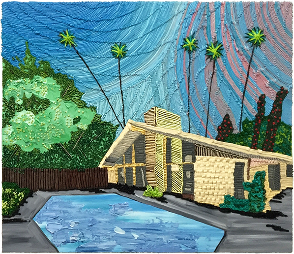
The Edris House Pool, 2016
oil on canvas
photograph courtesy of Caroline Larsen
There’s an image of a house in Morocco I’ve been looking at for three years almost. It’s Yves St. Laurent’s house in Morocco. I’m going to make four paintings of the same size. It’s a cobalt blue house that has a super bright orange or red ceiling. So sometimes it takes me a while to figure out exactly how I’m going to build the painting. They’re so wrapped up in technique, I have to know whether I’m going to use sand or dirt. I use this really cheesy stenciling paintbrush to get the dirt or sand looking its best. I’ll have to do that first, then I’ll have to do the sky because I want the trees to go on top of the sky. I have to figure out where I’m going to start.
I work on everything flat so I’m leaning over it too. With the abstract floral paintings, I’ll start in the middle and go out or else I’ll just have a shirt covered in paint.
BM: Do you work on the floor?
CL: No, on a crate. But the works on paper, I’ve been sitting down on my stool and making them.
BM: Is this the first time you’re working on paper with these?
CL: Yes!
BM: You’re getting a lot of texture.
CL: I’m just treating them like they were canvas. It’s oil paper, like fancy paper.
BM: But they’re not going to be as 3D?
CL: They are. But one of these guys, I like the way it looks with the line drawing and iridescent acrylic paint, so maybe I’ll just leave it like that.
BM: So another question I had for you was, who are some of your favorite painters or artists?
CL: My top favorite artist is Chris Ofili. He’s my number one favorite.
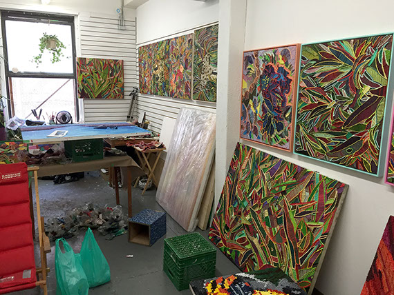
Studio of Caroline Larsen
photograph courtesy of Caroline Larsen
BM: That totally makes sense.
CL: That show he had at the New Museum just blew my mind. That’s where I got really into the red and green palette. I had never seen those paintings before. All the other work in the show, you know like the porn and the elephant dung, I’d seen all of those but I had never seen that room with the super tropical, with the two colors, and I was like “Whoa!” That kind of sensation is, in a weird way, what I want to express in my work: you just go in that room and the paintings take you to the location.
I really like Ed Ruscha. He did these mountain paintings. That was the initial seed for me getting into mountain paintings. I guess around 6 years ago, I was looking through Art Forum and he had an ad and it was one of his mountains. I just copied it. I made a little painting, it’s in my apartment now… (the painting and the ArtForum ad) it doesn’t look anything like his painting. I photocopied it and traced it onto a little board, and then I spent a week in my parent’s backyard outside with a little easel painting it. I felt like I almost had a little beret on.
I like David Hockney’s work a lot. Ed Ruscha does pools too, so they’re my two California pool guys. I’m super into those works. And they’re both not from California, but they’ve both interpreted the Los Angeles landscape with the houses and the pools, and the feeling of the city. They are outsiders looking in, that’s kind of where I feel like I’m coming from as well.
BM: Is LA specifically something you’re interested in?
CL: Yes, specifically. I don’t know why. I feel like it’s maybe that I watch a lot of the E! Channel, or that LA is where movies and television are made and while we don't really go see movies. I think it's influence is so far reaching that its almost impossible to escape.
BM: Was it a big deal to come to New York and come to grad school? Was it a major decision?
CL: No, not really! Its only an 8 hour drive.
Sliver Lake Backyard, 2016
oil on canvas
photograph courtesy of Caroline Larsen
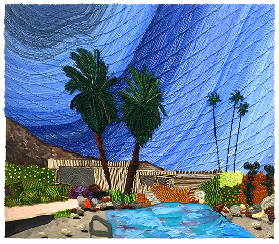
BM: So you’re from Florida but you went to Canada?
CL: No, so I’m Canadian, but grew up in Florida. We’d go back and forth a lot.
BM: Was Pratt your first choice?
CL: Yes! I applied to Pratt because they’re so painterly. I feel like so many of the young, exciting painters are coming out of Pratt. So I wanted to go there. I applied to UCLA as well, but their program is three years instead of two and that’s a little long. To move to Los Angeles to go to school would be a big change. But from Toronto to New York, it’s not that much more expensive here. And I feel like quality of life is so much better here because I can ride my bike everywhere, take the train…
BM: When you started painting LA, had you been there?
CL: Yes, we’d been there a few times. One of my best friends lives down there so we’d go see him all the time. Every time we went there, we just had the best time. But it’s really because he was planning out our trips. It was nice because I didn’t have to make any decisions. And he would drive everywhere.
BM: But vacation mode is so different from the day to day.
CL: I know! All the driving! But I guess the same can be said about anywhere! Being on vacation is such a different experience! It’s like the idealized version of a location!
BM: Do you use source pictures for the floral ones too or is that from your imagination?
CL: I use photos for those too. But most of the times it’ll just be to get the shape down. A lot of times it’ll be a floral picture of Bodega flowers because then you have the neat shape of the cellophane that’s going through them as well.
BM: Do you take the photos of those?
CL: Sometimes. I also Google them. Or I’ll find a photo on Google and isolate a thing and build it out on Photoshop. Same thing with fruits. I’ll use Photoshop if I find a banana shape I like.
BM: So partially created.
CL: Yeah, like half and half.
BM: You used the word craft earlier. It seems like a dirty word for artists sometimes, but you used it freely.
CL: Yes, I think the woven works are a little bit more of a craft reference. They’re kind of knit. Especially the older mountain paintings that have borders around them, all the black and white borders. Also, in putting a braid border around the painting, to me that’s directly referencing craft, which I’m into. My work is also pretty kitschy. I don’t think the craft art debate is even a thing anymore. I use a lot of quote unquote craft techniques, like the scrapbook stenciling technique to get the dirt look, or sand. Old pots and tapestries in museums, I’ll look at that stuff a lot, even though you could put tapestries more in the art category. You needed to have a team of a hundred and fifty people to make one of those things.
BM: Yeah, at one point in time they were more expensive than paintings. I guess to wrap up, is there anything else you want to say or make known about your work?
CL: We’ve talked a lot about it. I think with my work, I don’t want it to get lost in cool technique or weird technique, so it’s important that the technique really lends itself to the subject matter in my work. It’s important that the paint is really setting the mood.
BM: That’s the nuanced thing you create with paint that’s sort of indescribable; as a viewer you just sort of feel something or you’re transported, it’s generous of you.
CL: Thanks! I am most happy with the work when you can stand in front of the painting and feel like you are transported to a different location, or get a sensation!
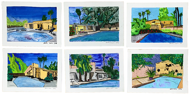
Paintings on paper from studio of Caroline Larsen
photograph courtesy of Caroline Larsen
Brigitte Mulholland is currently the Sales Associate at Jane Lombard Gallery in Chelsea and an independent curator. She mounted a pop-up show in the Landmark Arts Building earlier this year, and is curating a show at Lesley Heller in February 2017. She was formerly the director of Jane Kahan Gallery in New York.
Caroline Larsen is an artist in Brooklyn, NY. She earned an MFA from Pratt Institute in 2015. Recent solo exhibitions include Kabloom!, at The Hole; Fruits and Foliage at Wave Hill Public Gardens; and Lush Life at General Hardware Contemporary in Toronto. She has been featured in the New York Times, Two Coats of Paint, and Whitewall Magazine.
Disclaimer: All views and opinions expressed are those of the authors and do not necessarily reflect the views of the editors, owner, advertisers, other writers or anyone else associated with PAINTING IS DEAD.
